
Cloud Dancer: A Colour for New Beginnings

Some colours arrive loudly, demanding attention.
Others enter quietly, almost imperceptibly — yet they stay with us, grounding us, preparing us for what comes next. Cloud Dancer, Pantone Colour of the Year 2026, belongs unmistakably to the second category.
At first glance, Cloud Dancer may appear understated, even elusive. It doesn’t shout trend or statement. Instead, it feels like a pause. A breath. A soft clearing of space. And perhaps that is precisely why it feels so aligned with the energetic moment we are living through.
From a numerological perspective, 2026 carries a karmic number 1, a powerful symbol linked to the Sun — the ultimate source of energy, vitality, and creation.
Number 1 represents beginnings, leadership, and the courage to step into a new cycle.
Yet it does not exist in isolation. It comes after the 9, the number of completion, closure, and release. Before anything new can truly begin, something else must gently come to an end.

This transition — from completion to rebirth — requires space. Calm. Stillness.
Astrologically and energetically, this is not a year for chaotic reinvention, but for conscious rebuilding.
You cannot start again on unstable ground. You cannot create clarity from noise. Every true beginning needs a clean foundation — something that brings peace to the heart and quiet to the mind.
This is where Cloud Dancer reveals its deeper meaning.
Its ethereal, almost weightless presence evokes a sense of reset and renewal. It feels airy but grounded, neutral yet emotionally resonant. More than a colour to be worn or displayed, Cloud Dancer behaves like a foundation — a base upon which new stories, styles, and identities can be built with intention.

For me, this is the true essence of Cloud Dancer:
- a colour that doesn’t ask to be noticed, but to be felt.
- A colour that clears, rather than decorates.
- A colour that gently reminds us that every new beginning starts with calm.
And perhaps that is exactly the energy we need now.
Understanding Cloud Dancer

Cloud Dancer is best described as an ethereal off-white, hovering delicately between warmth and coolness.
It is not a crisp, optical white, nor does it lean heavily into cream or beige. Instead, it occupies a refined, almost intangible space — soft, airy, and quietly luminous.
From a colour theory perspective, Cloud Dancer sits within the neutral spectrum, yet it carries a subtle complexity that makes it far more nuanced than it appears at first glance. Its undertone is gently balanced, with a whisper of warmth that prevents it from feeling stark, and a cool clarity that keeps it modern and light.
This equilibrium is precisely what gives Cloud Dancer its versatility — and its emotional depth.
Unlike traditional whites, which often create strong contrast and demand visual attention, Cloud Dancer absorbs light rather than reflecting it aggressively.
This makes it exceptionally flattering in movement, fabrics, and layered styling, where it reads as soft, fluid, and harmonious rather than rigid or severe.
Cloud Dancer in Fashion, Accessories, and Materials
In fashion, Cloud Dancer behaves less like a colour and more like an atmosphere.
When used in garments, it lends an impression of lightness and ease, particularly in flowing silhouettes, natural fibres, and matte or softly textured fabrics.
It enhances volume without heaviness and structure without harshness.

In accessories — especially bags, shoes, and leather goods — Cloud Dancer acts as a sophisticated neutral. It offers a refined alternative to classic white, ivory, or beige, elevating both minimal and more expressive outfits without overpowering them.
Its understated nature allows it to support bolder colours, intricate textures, and statement details while maintaining overall visual balance.
Who Cloud Dancer Flatters — and How to Wear It
Because of its gentle neutrality, Cloud Dancer can work across a wide range of complexions, but how it is worn matters.
On light or low-contrast colouring, Cloud Dancer blends seamlessly, creating an elegant, cohesive effect.
On medium to deeper complexions, it provides a soft, luminous contrast that feels refined rather than stark.
For those who find pure white draining or unforgiving, Cloud Dancer offers a more forgiving, wearable alternative.
The key is placement and pairing. Worn close to the face, Cloud Dancer benefits from being balanced with:
warm metals or soft colour accents for warmer undertones,
cool greys, silvers, or muted blues for cooler undertones,
or deeper grounding shades for higher contrast needs.


Why Cloud Dancer Is Not a Statement Colour
What truly distinguishes Cloud Dancer is that it does not aim to dominate an outfit or space. It doesn’t declare a mood; it creates the conditions for one.
This is why Pantone treats it less as a hero shade and more as a foundational base — a colour designed to harmonise, support, and elevate others.

Cloud Dancer is a beginning colour. It clears visual noise. It allows surrounding colours to breathe. And in doing so, it invites a more intentional, mindful approach to styling and design.
Understanding Cloud Dancer means recognising that its power lies not in visibility, but in presence.
Cloud Dancer as a Foundation Colour
When we talk about colour trends, we often focus on what stands out — the bold shades, the eye-catching hues, the ones that make a statement the moment you walk into a room. But every now and then, a colour comes along that does something far more interesting. Instead of demanding attention, it quietly sets the scene.
This is exactly the role Cloud Dancer plays.
Rather than acting as a statement colour, Cloud Dancer functions as a foundation colour — the visual equivalent of a calm, well-prepared canvas. It doesn’t compete with other shades; it gives them space to shine.
In other words, it does a lot of the hard work in the background, and does it rather brilliantly.

A foundation colour is not meant to be the star of the show. It’s there to:
create harmony,
soften contrasts,
and bring coherence to a palette as a whole.
Cloud Dancer excels at this because of its gentle neutrality and emotional lightness. It clears visual clutter, making everything paired with it feel more intentional — and frankly, a bit more put together.
Why Pantone Built Palettes Around Cloud Dancer

This is where Pantone’s approach becomes particularly telling.
Instead of positioning Cloud Dancer as a standalone hero shade, the Pantone Colour Institute developed seven complementary colour palettes designed to work with it.
That alone tells us something important: Cloud Dancer was never meant to work in isolation.
Think of it this way — Cloud Dancer is the quiet constant, while the palettes provide personality, rhythm, and direction. Each palette brings out a different side of the colour, shaping its mood and purpose depending on the combination.
Some palettes feel soft and cocooning, others fresh and optimistic, others still more grounded or expressive. Yet in every case, Cloud Dancer acts as the anchoring element, keeping the overall effect balanced and wearable.
It’s a bit like having the perfect neutral in your wardrobe — once you’ve got it, suddenly everything else makes more sense.
What This Means for the Way We Use Colour
This palette-led approach reflects a broader shift in how we relate to colour today. Rather than chasing individual “it shades”, there’s a growing desire for versatility, longevity, and emotional coherence.
Cloud Dancer answers that need beautifully. It allows you to:
build outfits gradually rather than all at once,
mix stronger colours without visual overload,
and adapt trends to your own colouring and lifestyle.
In practical terms, this means you don’t need to reinvent your wardrobe every season. You can start with a calm, neutral base — Cloud Dancer — and then choose the palette that resonates most with you. The rest follows quite naturally.
A Quietly Intelligent Colour Choice
There’s something quietly intelligent about a foundation colour. It doesn’t try too hard. It doesn’t need to prove itself. And in a world that often feels visually noisy, that restraint is rather refreshing.
Cloud Dancer reminds us that good style isn’t about excess. It’s about clarity, balance, and knowing when to let things breathe. Or, to put it another way: sometimes the smartest move is to take a step back and start from a clean, calm base.
And that, in essence, is why Pantone’s seven palettes matter. They aren’t there to complicate Cloud Dancer — they’re there to help each of us find our own way of bringing it to life.
Palette #1 — Soft Serenity

Overall Mood & Emotional Impact
The first palette Pantone pairs with Cloud Dancer is all about quiet calm and gentle balance. This is a palette that soothes rather than stimulates, creating a sense of ease, openness, and emotional lightness. It feels unhurried, reassuring, and slightly introspective — the sort of colour combination that makes you breathe a little deeper without quite realising why.
There’s nothing showy here, and that’s very much the point.
Soft Serenity leans into subtlety, embracing a pared-back elegance that feels restorative rather than decorative.
It’s the visual equivalent of a peaceful morning or a moment of stillness in an otherwise busy day.
Key Colours in the Palette
Alongside Cloud Dancer, this palette is built around delicate, low-contrast hues:
muted pastels,
soft greys,
pale blues,
gentle blush or barely-there lilac tones.
All colours are softened, never saturated, and carefully balanced so that none overpower the others. The overall effect is cohesive and airy, with Cloud Dancer acting as the quiet thread that ties everything together.
Why It Works with Cloud Dancer
Soft Serenity works so beautifully with Cloud Dancer because both share the same visual language: lightness, restraint, and emotional clarity. Cloud Dancer amplifies the softness of the surrounding hues, while the palette adds just enough variation to prevent it from feeling flat or washed out.
This is a textbook example of how a foundation colour operates. Cloud Dancer doesn’t lead the palette — it supports it, allowing the other shades to emerge gently and naturally. Everything feels considered, nothing feels forced.
Who This Palette Is Best Suited For

Soft Serenity is particularly flattering for:
low to medium contrast colouring,
naturally soft features,
those who feel overwhelmed by strong or highly saturated colours.
It tends to work especially well for:
Summer colour types,
lighter Springs,
and anyone who gravitates towards a refined, understated style.
If you’ve ever felt that bold colours “wear you” rather than the other way around, this palette may feel like a bit of a relief.
How to Use Soft Serenity in Fashion

In clothing, this palette shines in:
flowing silhouettes,
layered textures,
lightweight fabrics such as silk, linen, fine wool, or cotton blends.
Outfits built around Soft Serenity feel cohesive even when made up of several pieces, as the colours naturally blend into one another. It’s ideal for everyday elegance — polished, but never stiff.
Accessories, Bags & Styling Tips
This is where Cloud Dancer truly comes into its own.
Used in bags or shoes, Cloud Dancer becomes the perfect neutral anchor, pairing effortlessly with all the softer tones in the palette. Think:
a Cloud Dancer bag with a pale blue or blush outfit,
soft grey tailoring lifted by Cloud Dancer accessories,
tone-on-tone looks that rely on texture rather than contrast.

A word of advice: keep finishes soft. Matte leathers, suede, brushed metals and natural fibres work far better here than anything overly glossy or sharp. Otherwise, the effect can feel a bit too harsh — and that rather defeats the purpose.
Using the Palette Softly or with Intention
Soft Serenity doesn’t need much help to work. A little goes a long way.
For a subtle approach, stick to two or three colours and let Cloud Dancer do the heavy lifting. For a slightly more defined look, introduce one marginally deeper shade to ground the outfit — nothing dramatic, just enough to add structure.
Either way, this palette is about restraint, harmony, and ease. It’s not trying to impress; it’s trying to make you feel good — and honestly, that’s no small thing.
Let’s move on, and I’m sure you’ll enjoy this one, because Palette #2 shifts the mood completely, while still letting Cloud Dancer keep its quiet authority.
Here we go.
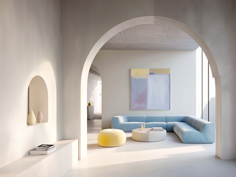
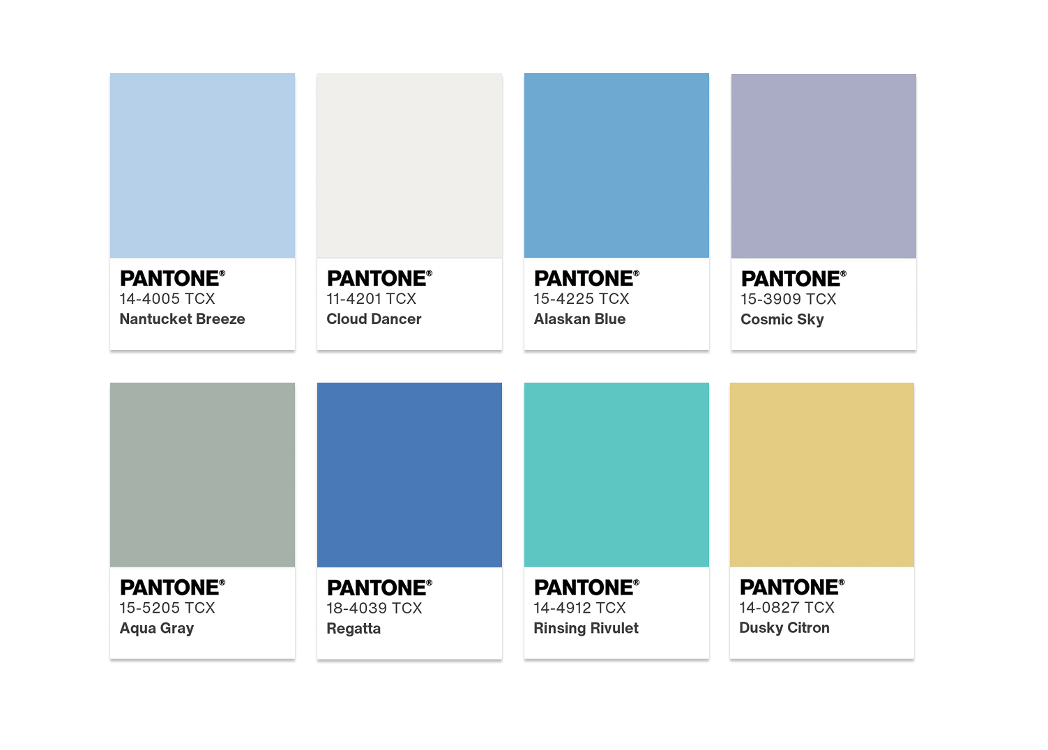
Palette #2 — Luminous Balance
Overall Mood & Emotional Impact
This version of Luminous Balance is calm, contemplative, and quietly radiant.
Rather than expressing brightness through warmth or saturation, it does so through light, space, and contrast between softness and depth.
Emotionally, the palette feels balanced and reassuring, with a slightly introspective quality. It evokes misty mornings, filtered daylight, and a sense of measured clarity. There’s freshness here, but it’s restrained — thoughtful rather than exuberant. A palette that invites you to slow down, take stock, and move forward with intention.
Key Colours in the Palette

Alongside Cloud Dancer, this palette is composed of cool, softened hues with varying depth, including:
Veiled Vista (a pale, milky mint green),
Baltic Sea (a clean, airy light blue),
Golden Mist (a muted, softly warm yellow-beige),
Quiet Violet (a subdued, elegant lavender),
Cloud Cover (a balanced mid-grey),
Hematite (a deep, earthy grey),
Blue Fusion (a muted blue-grey with depth).
The colours range from light to dark, creating a sense of visual rhythm and dimension without relying on strong saturation.
Why It Works with Cloud Dancer
Cloud Dancer is the natural anchor of this palette. Its ethereal neutrality allows the lighter shades to feel luminous rather than washed out, while also softening the deeper greys and blues so they never feel heavy or oppressive.
What makes this palette particularly refined is the play between light and shadow.
Cloud Dancer bridges these contrasts seamlessly, ensuring the palette remains harmonious and wearable. It’s a subtle balancing act — and one that works beautifully.
Who This Palette Is Best Suited For

Luminous Balance is especially flattering for:
cool to neutral undertones,
low to medium contrast colouring,
those who prefer softness with structure rather than overt brightness.
It works particularly well for:
Summer colour types,
softer Winters,
and anyone drawn to elegant, atmospheric palettes with a modern edge.
If you enjoy colour that feels calm, intelligent, and quietly expressive, this palette will likely resonate deeply.
How to Use Luminous Balance in Fashion

In clothing, this palette excels when used in layered, thoughtful combinations.
Cloud Dancer works beautifully as a base — shirts, blouses, knitwear — while the lighter hues add freshness and the deeper shades introduce structure.
The contrast between pale mint or blue and deeper greys or blue-greys creates interest without visual noise.
Silhouettes benefit from softness and movement: gentle tailoring, fluid fabrics, and clean lines work particularly well here.
Accessories, Bags & Styling Tips
Accessories in this palette should echo its refined restraint.
A Cloud Dancer bag pairs effortlessly with both the lighter and darker tones, acting as a visual pause that keeps the overall look balanced.
Alternatively, accessories in Cloud Cover, Blue Fusion, or Hematite add depth while maintaining cohesion.
Materials should feel smooth or softly textured rather than glossy.
For hardware, cool or neutral metals — brushed silver, pewter, or soft gunmetal — complement the palette’s understated elegance.

Using the Palette with Confidence or Restraint
Luminous Balance is about controlled contrast.
Rather than using many colours at once, combine light and dark intentionally: one luminous shade, one grounding shade, and Cloud Dancer as the connective thread. This creates outfits that feel considered, modern, and emotionally balanced.
This palette proves that luminosity doesn’t need to be loud. When light and shadow are handled with care, the result is a style that feels calm, confident, and quietly powerful.
Now buckle up — Palette #3 brings a noticeable shift in depth and grounding, while still keeping Cloud Dancer firmly in its role as the quiet anchor.
Let’s dive in.
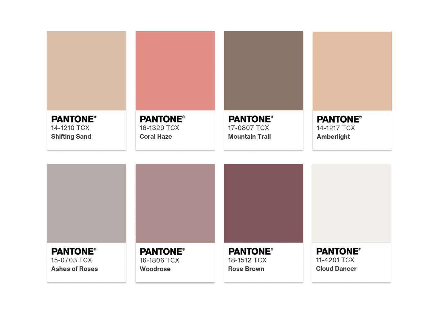
Palette #3 — Grounded Harmony
Overall Mood & Emotional Impact
Grounded Harmony introduces depth, reassurance, and stability into the Cloud Dancer universe. This palette feels calm, confident, and quietly rooted — less about lightness, more about presence. It has a reassuring quality, the kind that makes you feel steady and supported, rather than floaty.
There’s something distinctly grown-up about this palette.
It doesn’t chase freshness or softness; instead, it leans into balance and composure. It’s calm without being passive, strong without being heavy — a rather tricky balance, but one that works beautifully here.
Key Colours in the Palette

This palette pairs Cloud Dancer with earth-informed, muted tones, such as:
soft taupes,
warm greys,
muted browns,
gentle khaki or peach-inspired shades.
None of these colours are dark or dense. They’re carefully softened, keeping the palette approachable and wearable, while still providing a sense of grounding and structure.
Why It Works with Cloud Dancer
Cloud Dancer plays a crucial role in preventing these earthier tones from feeling too serious or heavy. It lifts the palette, adding air and light, while the grounding shades give Cloud Dancer substance and weight.
Together, they create a harmonious tension: light meets earth, softness meets structure. The result is a palette that feels balanced, dependable, and quietly elegant.
Who This Palette Is Best Suited For

Grounded Harmony is particularly flattering for:
neutral to warm undertones,
medium to higher contrast colouring,
those who prefer understated depth over brightness.
It works especially well for:
Autumn colour types,
deeper Springs,
and anyone drawn to timeless, natural palettes with a refined edge.
If you favour colours that feel reassuring, classic, and easy to live with, this palette may well become a staple.
How to Use Grounded Harmony in Fashion

In clothing, this palette lends itself beautifully to:
structured garments,
tailored pieces,
natural fabrics with a bit of weight, such as wool, leather, or sturdy cotton.
Cloud Dancer works particularly well in lighter layers — shirts, knits, linings — bringing lightness close to the face, while the deeper, earthier shades ground the overall look.
This palette is excellent for transitional seasons and for building a wardrobe that feels cohesive and enduring rather than trend-driven.
Accessories, Bags & Styling Tips
When it comes to accessories, Cloud Dancer offers a refined counterpoint to richer, earth-based tones.
A Cloud Dancer bag softens outfits built around taupe, brown, or khaki, preventing them from feeling too heavy or overly classic.
Leather finishes should feel natural rather than polished — think soft grain, suede, or lightly textured surfaces.
As for metals, muted finishes work best here: antique gold, brushed bronze, or soft pewter rather than anything too bright. It keeps the look grounded and consistent.

Using the Palette with Ease or Definition
For an everyday approach, keep the palette simple: one grounding colour, Cloud Dancer, and perhaps a secondary neutral. It creates an effortlessly pulled-together look.
For more definition, you can introduce contrast through texture or structure rather than colour. Sharp colour jumps tend to disrupt the calm confidence this palette is so good at delivering.
Grounded Harmony proves that neutrality doesn’t have to be bland. When done well, it can feel rich, intentional, and deeply reassuring — which, let’s be honest, is no bad thing.
Okay, let’s move on to Palette #4, which will introduce a cooler, more contemporary edge into the Cloud Dancer story. 😎✨
As just mentioned, this is the colour palette where things take a more contemporary turn, and it adds a really important dimension to Cloud Dancer’s versatility.
Let’s go.
Palette #4 — Quiet Contrast
Overall Mood & Emotional Impact
Quiet Contrast introduces cool clarity and modern restraint into the Cloud Dancer narrative. This palette feels composed, intelligent, and slightly architectural — the sort of combination that doesn’t rely on softness or warmth to feel inviting.
There’s a crispness here, but it’s never cold. Instead, it feels intentional, balanced, and quietly confident. It’s the palette of clean lines, thoughtful choices, and a certain understated sharpness — polished, but not precious.
Key Colours in the Palette

Alongside Cloud Dancer, this palette is built around cool-toned, desaturated hues, such as:
soft greys,
muted blues,
blue-based charcoals,
cool stone or misty slate tones.
All colours are controlled and slightly softened, ensuring the palette remains refined rather than stark. There’s contrast, yes — but it’s measured, never aggressive.
Why It Works with Cloud Dancer
Cloud Dancer plays a crucial softening role within this cooler framework. Without it, the palette could easily tip into something too sharp or austere.
Cloud Dancer introduces lightness and a hint of warmth, preventing the cooler shades from feeling distant or overly severe.
At the same time, the cool tones bring definition and structure to Cloud Dancer, anchoring its ethereal quality and giving it a more contemporary edge.
It’s a subtle push and pull — and it works rather well.
Who This Palette Is Best Suited For

Quiet Contrast is especially flattering for:
cool or neutral-cool undertones,
higher contrast colouring,
those who feel most at ease in crisp, modern palettes.
It tends to work beautifully for:
Winter colour types,
cooler Summers,
and anyone whose personal style leans minimalist, modern, or slightly tailored.
If you gravitate towards clean silhouettes and refined simplicity, this palette will likely feel very natural.
How to Use Quiet Contrast in Fashion

In clothing, this palette thrives in:
structured tailoring,
sharp yet simple silhouettes,
smooth, clean fabrics such as fine wool, crisp cotton, or technical blends.
Cloud Dancer works particularly well in pieces worn close to the face — shirts, blouses, knitwear — where it softens the contrast and adds approachability.
The cooler, darker shades are best used to define shape and structure.
This palette is ideal for professional wardrobes or for anyone who appreciates a polished look without unnecessary embellishment.
Accessories, Bags & Styling Tips
Accessories in this palette benefit from restraint.
A Cloud Dancer bag offers a welcome softness against darker greys or blues, creating balance without breaking the overall harmony.
Leather finishes should be clean and refined — smooth or lightly grained rather than overly textured.
When it comes to hardware, cooler metals work best: silver, brushed steel, or soft chrome.
Keep things simple — fussiness can feel out of place here.

Using the Palette with Precision
Quiet Contrast rewards clarity. A limited number of colours, used intentionally, creates the strongest effect.
For everyday wear, stick to Cloud Dancer plus one darker cool tone. For a more defined look, introduce a second supporting shade, but resist the urge to overcomplicate things. This palette really does shine when you let it speak quietly.
Quiet Contrast proves that modern palettes don’t need to feel cold or impersonal. With Cloud Dancer as its anchor, even cooler tones can feel balanced, refined, and quietly inviting.
Next up: Palette #5, which will bring in a warmer, more expressive energy — a lovely contrast to this cool interlude.
Palette #5 — Warm Expression
Overall Mood & Emotional Impact
Warm Expression brings a sense of depth, warmth, and emotional richness into the Cloud Dancer story. This palette feels expressive and confident, yet still grounded and controlled. It’s not about bold statements for the sake of it; it’s about colour used with purpose.
There’s a welcoming quality here — a feeling of ease mixed with personality. It feels creative without being overwhelming, and warm without tipping into anything overly dramatic. In short, it’s expressive, but it knows when to stop. A rather good quality, all things considered.
Key Colours in the Palette
This palette pairs Cloud Dancer with warm, nuanced hues, such as:
muted terracotta,
soft caramel,
warm coral tones,
gentle cinnamon or clay-inspired shades.
All colours are slightly softened, never overly saturated. They carry warmth and character, but always with a sense of restraint that keeps the palette wearable and elegant.
Why It Works with Cloud Dancer
Cloud Dancer is essential in tempering the richness of these warmer shades. Without it, the palette could easily feel too intense or heavy. Cloud Dancer lightens the mood, introduces air, and creates breathing space between the colours.
At the same time, the warmth of the surrounding hues gives Cloud Dancer more presence and substance, anchoring its ethereal quality and preventing it from feeling too fragile or insubstantial.
Together, they strike a lovely balance between warmth and lightness.
Who This Palette Is Best Suited For

Warm Expression is particularly flattering for:
warm undertones,
medium to higher contrast colouring,
those who enjoy warmth and richness but prefer subtlety over drama.
It works especially well for:
Autumn colour types,
warmer Springs,
and anyone whose personal style leans expressive, creative, or naturally confident.
If you like colour that feels alive but still polished, this palette will feel very much your cup of tea.
How to Use Warm Expression in Fashion

In clothing, this palette shines in:
relaxed yet structured silhouettes,
tactile fabrics,
pieces with gentle movement or drape.
Cloud Dancer works beautifully as a balancing element — shirts, knits, or trousers — while the warmer hues add character through dresses, jackets, or statement pieces.
This palette is ideal for creating outfits that feel interesting without feeling busy.
Accessories, Bags & Styling Tips
Warm Expression is particularly strong when it comes to bags and accessories.
A Cloud Dancer bag offers a calm counterpoint to terracotta, rust, or coral tones, lifting the overall look and keeping it refined.
Leather with a natural finish, suede, or softly textured materials work especially well here.
Metals should lean warm but understated: brushed gold, antique brass, or soft copper rather than anything too shiny. You want warmth, not glare.

Using the Palette with Confidence or Restraint
For everyday wear, keep the palette grounded: Cloud Dancer plus one warm shade is often enough.
For more expressive looks, you can layer two warm tones together — just make sure Cloud Dancer remains visible somewhere in the outfit to keep things balanced. It acts as a visual pause, preventing the palette from tipping into excess.
Warm Expression shows how colour can be emotionally rich without being overwhelming — a beautiful reminder that warmth, when used well, never needs to shout.
…ready for Palette #6?! This one will introduce a bolder, more dynamic energy to the story. Here things become more assertive, while Cloud Dancer quietly keeps everything in check. Palette #6 adds real contrast and confidence to our colour romance.
Here we go.
Palette #6 — Confident Energy
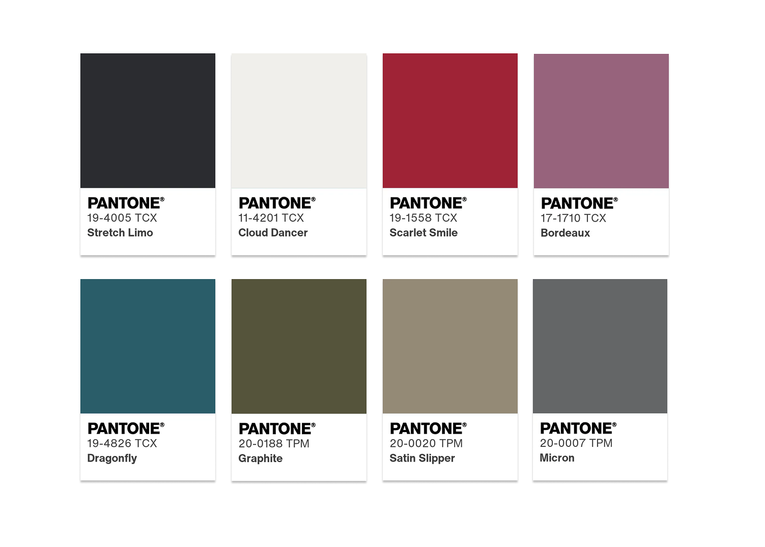
Overall Mood & Emotional Impact
Confident Energy is the most assertive and dynamic palette in the Cloud Dancer family so far. It feels purposeful, self-assured, and quietly bold — not reckless, not overpowering, but unmistakably present.
This palette carries momentum. It feels forward-looking, decisive, and a touch more daring, yet still grounded.
Think clarity of intention rather than impulse. It’s the palette of women who know where they’re going, even if they don’t feel the need to explain themselves.
Key Colours in the Palette

Alongside Cloud Dancer, this palette introduces stronger, more defined hues, such as:
deep blues or inky navy,
rich teal or petrol tones,
muddy greens,
- rich scarlet and burgundy
slightly darkened neutrals with depth.
These colours are fuller and more saturated than in previous palettes, bringing contrast and strength without becoming harsh or flashy.
Why It Works with Cloud Dancer
Cloud Dancer is absolutely essential here. These deeper, more confident shades could easily dominate on their own.
Cloud Dancer softens the impact, creates visual breathing space, and keeps the palette feeling refined rather than forceful.
At the same time, the stronger colours give Cloud Dancer structure and authority, anchoring its lightness and preventing it from drifting into something too delicate. It’s a classic balance of strength and softness — and it works a treat.
Who This Palette Is Best Suited For

Confident Energy is particularly flattering for:
medium to high contrast colouring,
neutral or cooler undertones,
those who enjoy depth and presence in their colour choices.
It works beautifully for:
Winter colour types,
deeper Summers,
and anyone whose style leans confident, contemporary, or slightly bold without being flashy.
If you like colour that makes you feel capable and composed, this palette may well become a favourite.
How to Use Confident Energy in Fashion

In clothing, this palette excels in:
clean, structured silhouettes,
strong lines,
pieces with architectural clarity.
Cloud Dancer works best as a softening element — shirts, knits, or lighter layers — while the deeper shades define the outfit’s structure and direction. The result is a look that feels powerful yet approachable.
This palette is particularly effective for workwear, statement outerwear, and situations where you want to feel polished and in control without going over the top.
Accessories, Bags & Styling Tips
Accessories play a key role here.
A Cloud Dancer bag brings lightness to outfits built around navy, teal, or deep green, preventing them from feeling too heavy or severe.
Structured bags, clean lines, and refined finishes work best — this is not the place for anything overly fussy.
Hardware should remain restrained: brushed silver, gunmetal, or soft chrome rather than high-shine finishes. You want confidence, not noise.

Using the Palette with Intention
Confident Energy benefits from clarity and restraint.
For everyday wear, pair one strong shade with Cloud Dancer and keep the rest neutral. For more impact, you can combine two deeper hues — just make sure Cloud Dancer remains visible to maintain balance.
This palette proves that boldness doesn’t have to be loud. When anchored properly, confidence can be calm, focused, and quietly powerful — and Cloud Dancer makes that possible.
And now… we’re ready for the final palette (#7) — the one that brings everything together and completes the story in a beautifully intentional way.
Oh, guys, this is a colour romance — and what a finale 😘✨
Palette #7 is the perfect closing note: playful, bright, and undeniably exotic.
Palette #7 — Juicy Sprint

Overall Mood & Emotional Impact
Juicy Sprint is vibrant, joyful, and unapologetically alive.
This palette captures movement, warmth, and optimism — the kind of energy you associate with long summer days, spontaneous plans, and a renewed appetite for colour after a period of restraint.
Emotionally, it feels invigorating and mood-lifting. There’s a sense of playfulness here, but it’s not chaotic or childish.
Thanks to Cloud Dancer, the palette remains balanced and wearable, even at its most saturated. Think sunshine, tropical air, and a fresh burst of enthusiasm — all wrapped up in a refined, modern way.
Key Colours in the Palette

Alongside Cloud Dancer, Juicy Sprint features a selection of bold, tropical-inspired hues, including:
Iris Orchid (a lively, expressive purple),
Capri (a fresh, turquoise blue),
Kiwi Colada and Sunny Lime (zesty yellow-greens),
Bright Marigold and Blazing Yellow (sun-drenched, energetic yellows),
Paradise Pink (a vivid, warm pink with real presence).
These colours are saturated, joyful, and full of character. Each one brings its own personality, yet together they form a cohesive, high-energy palette.
Why It Works with Cloud Dancer
Without a grounding element, a palette like this could easily feel overwhelming. This is where Cloud Dancer proves its value once again.
Cloud Dancer softens and stabilises the intensity of these tropical shades. It creates visual pauses, allowing the eye to rest, and prevents the palette from tipping into excess. Instead of competing with the brighter colours, it frames them — making them feel intentional, fresh, and surprisingly elegant.
In short, Cloud Dancer turns exuberance into harmony.
Who This Palette Is Best Suited For

Juicy Sprint is particularly flattering for:
medium to high contrast colouring,
warm or neutral undertones,
those who come alive in bright, clear colours.
It works especially well for:
Spring colour types,
brighter Winters,
and anyone whose personality or style leans expressive, energetic, and optimistic.
If muted palettes leave you feeling a bit flat, this one may feel like a breath of fresh air.
How to Use Juicy Sprint in Fashion

In clothing, this palette is best approached with intentional restraint.
Rather than wearing many bright colours at once, let one hue take the lead — a Paradise Pink dress, a Capri blouse, or a Kiwi Colada skirt — and allow Cloud Dancer to act as the supporting base through trousers, jackets, or layering pieces.
Clean silhouettes and simple cuts work best here. The colour already does the talking, so there’s no need to overcomplicate the design.
Accessories, Bags & Styling Tips
Accessories are where Juicy Sprint truly shines.
A Cloud Dancer bag is the perfect companion to this palette: it grounds vivid outfits and keeps the overall look polished rather than overpowering.
Alternatively, brightly coloured bags work beautifully when paired with Cloud Dancer outfits, creating a bold yet balanced contrast.
Keep materials light and finishes clean — smooth leather, soft grain, or lightly textured surfaces.
Hardware should stay minimal, allowing colour to remain the star of the show.

Using the Palette with Purpose
The key to Juicy Sprint is confidence with control.
Use it when you want to express joy, creativity, and forward momentum — but always anchor it with Cloud Dancer to maintain harmony. One or two bright elements are often more effective than a full rainbow, creating looks that feel energising rather than exhausting.
Juicy Sprint reminds us that colour can be fun, expressive, and uplifting — and still refined. When grounded by the right foundation, even the boldest hues can feel balanced, wearable, and beautifully intentional.
Final Thoughts — Finding Your Cloud Dancer Story

Cloud Dancer may appear subtle at first, but as these seven palettes show, its potential is anything but limited. Acting as a foundation rather than a statement, it adapts, supports, and elevates — allowing each of us to interpret it in a way that feels personal and authentic.
Whether you’re drawn to softness, warmth, depth, contrast, or calm minimalism, there is a Cloud Dancer palette that can meet you exactly where you are — and gently guide you forward.
And perhaps that is the true beauty of this colour. It doesn’t impose an identity; it creates space for one to emerge.
A Gentle Invitation 🌍✨
If you’d like to explore which Cloud Dancer palette suits your colouring, style, and lifestyle best, I’d love to guide you.
My work is dedicated to helping women around the world build wardrobes that feel intentional, empowering, and deeply personal — one thoughtful choice at a time.
You can follow me here on the blog, connect with me on social media, or get in touch for personalised colour and style guidance. Wherever you are in the world, this journey is yours — and I’d be honoured to walk a part of it with you.
Here’s to calm beginnings, conscious choices, and a year built on clarity. 🤍✨
Thank you for reading until here, and looking forward to see you on here next week!
Always stay true to yourself, whatever fashion dictates 😘
XOXO
Agnese K
More Posts You’ll Love:


