


There was a time when I had absolutely no idea how to wear leopard print — in fact, I looked at it with a rather suspicious eye.
Unlike most of my friends and colleagues, I was born and raised in a small village in Tuscany, where bold prints like these were worn almost exclusively by grown women — usually over 50 — and only on special occasions. Think Christmas, New Year’s Eve, Easter… or by elegant ladies arriving from the mainland — Florence, Rome, Milan — to spend their holidays on Elba Island.
We’re talking about the ‘90s.
Even as a little girl, my curious eyes picked up on something subtle, yet unmistakable: there was a difference in the way “our women” styled their leopard print compared to those visiting from the cities. Something felt slightly… off. Not wrong, exactly — but not quite harmonious either.
It took me years to understand why.
Looking back now, with more experience and a trained eye, I realise it was never about the print itself. It was about how it was worn. Many local women wanted to emulate that effortless city elegance, but they simply didn’t have access to the same quality pieces. Living on an island in those days meant limited choice — and often, that meant garments that didn’t quite fit, didn’t flatter, or were made from less refined, synthetic materials.
Of course, this wasn’t true for everyone. Some women had the means to shop in the city, and it showed. But for many, the intention was there — the execution, less so.
And I say this with nothing but affection. I knew these women. Some of them are no longer with us, and I remember them all with great fondness.
I’m sure you can picture it.
Skin-tight leopard leggings, matching tops, sky-high heels, glossy fabrics, oversized gold jewellery… and absolutely nothing left to the imagination. A look that was loud, exaggerated, and — to my young eyes — quite intimidating.
After years of these associations, it’s no surprise that my interest in animal print slowly faded… until it disappeared altogether.
Until, quite unexpectedly, it came back.
About four or five years ago, something shifted. I can still remember the exact moment. I was at the weekly market with my mum, visiting her favourite fabric seller (her “pusher”, as we jokingly call him), when we spotted it: the most beautiful 100% cotton fabric, in a classic leopard print.
My mum — a professional tailor — didn’t hesitate for a second:
“This would look amazing on you.”
He handed me a mirror. I held the fabric up to my face… and that was it. I was sold.
A week later, I had my very first leopard print piece — proudly self-sewn, with a little technical help from my mum, of course.
And that changed everything.
Because sometimes, it’s not about time — it’s about perspective.
My relationship with leopard print has been a long one — decades, really — and if there’s one thing I’ve learned, it’s this: it’s not a trend. It never really was.
Designers like Stefano Dolce and Domenico Gabbana built an entire aesthetic around it. Leopard print is not just something you wear — it’s something you interpret.
And when done right, it becomes part of your signature.
So if, like me, you’ve ever hesitated — or you’re simply unsure how to wear it without slipping into those ‘90s film clichés — don’t worry.
There are just a few things you need to know.
And I’m very happy to share them with you.
If there’s one thing I’ve come to understand over the years, it’s that leopard print is not a passing trend — it’s a constant.
It has been reinterpreted time and time again, yet it never really disappears. And that’s because it holds something very few prints do: personality.
Italian fashion houses have always understood this instinctively.
Designers like Roberto Cavalli built entire collections around animal prints, celebrating their boldness and sensuality, while names like Gianni Versace transformed them into statements of confidence and glamour.
Even more playful interpretations came from creatives such as Elio Fiorucci, while brands like Gucci and Miu Miu continue to reinterpret leopard print in a modern, wearable way.
What this tells us is simple: leopard print adapts — but it never loses its essence.
And perhaps that’s why it works so beautifully at any age. It doesn’t try to be youthful or mature. It simply reflects the attitude of the woman wearing it.
If you’ve ever wondered how to wear leopard print without looking overdone, the answer lies in something very simple: restraint.
Italian style has never been about excess. It’s about balance, intention, and that subtle confidence that doesn’t need to prove anything.
When it comes to leopard print, this translates into a few unspoken rules.
#1
#2
Clean lines, quality fabrics, and neutral tones create that sense of ease that Italian women are known for.
#3
This is something designers like Franco Moschino understood perfectly — playing with boldness, yes, but always anchored by strong silhouettes and intention.
Because in the end, wearing leopard print well is not about being bold.
It’s about being considered.
When spring arrives, leopard print naturally becomes lighter, fresher, and more versatile than you might expect.
Instead of heavy fabrics and layered looks, this is the moment to let it breathe.
A flowing leopard skirt paired with a crisp white shirt instantly feels polished yet relaxed.
The structure of the shirt balances the movement of the print, creating a look that works just as well for a coffee in the city as it does for a casual lunch by the sea.
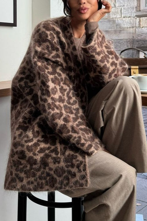
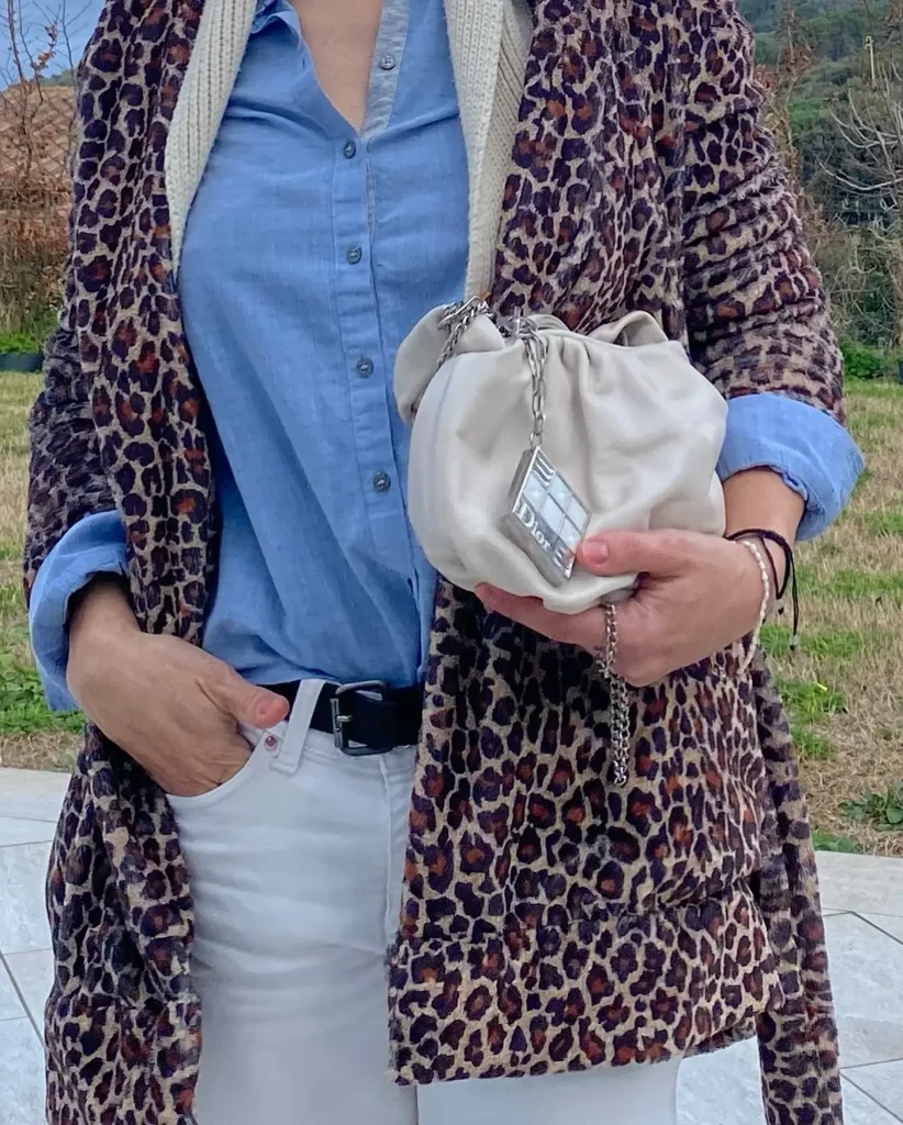
If you prefer something more understated, leopard print in accessories is always a beautiful entry point.
A scarf, a pair of shoes, or a structured bag can completely transform even the simplest outfit — think denim, a neutral blazer, and just a touch of print.
Denim, in particular, deserves a mention here. It grounds leopard print in the most effortless way, making it feel approachable and wearable for everyday life.
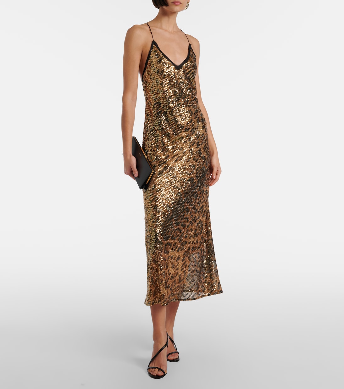
And then, of course, there’s the leopard dress.
Simple, fluid, and styled with minimal accessories, it becomes one of those pieces you can rely on without overthinking.
The key with all these combinations is the same: keep the silhouette clean, the styling intentional, and the overall look balanced.
This is probably the question I get asked the most — and understandably so.
Leopard print has a reputation. And if styled without care, it can quickly feel overwhelming.
But the difference between “too much” and just right is often surprisingly small.
👉 It’s in the fabric — avoid anything overly shiny or synthetic-looking.
👉 It’s in the fit — pieces that are too tight can take away from the elegance of the print.
👉 And it’s in the styling — too many bold elements at once can create visual noise.
Think of leopard print as already doing a lot of the work for you. It has texture, depth, and movement built into it.
So instead of adding more, try refining what’s already there.
This is where the Italian approach really shines: simplify, edit, and trust that less is often more.
One of the most common questions when it comes to leopard print is also the simplest: what colours actually work with it?
And the answer might surprise you.
Almost all of them — if you understand why.
Leopard print is incredibly versatile because it sits in that unique space between neutral and statement. Its warm undertones make it easy to pair, but also interesting enough to elevate even the simplest colour combinations.
Instead of following strict rules, it’s more helpful to think in terms of harmony and contrast.
Some colours blend seamlessly, creating soft, elegant looks. Others stand in contrast, adding freshness and a modern edge.
And once you start seeing it this way, styling leopard print becomes far less intimidating — and far more creative.
Let me tell you a little secret: once you understand how colour works, leopard print stops feeling “tricky” and starts feeling like the easiest thing in your wardrobe.
Because yes — it’s bold.
But it’s also incredibly forgiving.
Why? Because leopard print already contains a mix of warm tones — think caramel, brown, golden beige, black. That combination makes it behave almost like a textured neutral.
So instead of asking “Can I wear this with leopard?”, the better question is:
👉 “Do I want harmony… or contrast?”
Let’s play with both. 😎
These two deserve to be mentioned together, but they create slightly different moods.
Butter yellow is soft, creamy, almost understated.
When you pair it with leopard print, everything blends in the most elegant way. It works because both colours share that same warm, sun-kissed undertone.
Nothing clashes, nothing screams — it just flows.
Lemon yellow, on the other hand, is brighter, fresher, a little more playful.
It still works beautifully, but here you get a bit more contrast. It lifts the leopard print, gives it a spring energy, makes the whole look feel lighter.
Think of butter yellow as quiet luxury, and lemon yellow as fresh confidence.
If you want to know more about your colour season, and how to nail yellow with confidence, I explain all the details in this video here 👆.
Now this is where things get interesting.
Green sits opposite warm tones on the colour wheel, which means it naturally balances leopard print instead of blending into it.
Bottle green, in particular, adds depth — it’s rich, elegant, almost a bit mysterious.
Olive green is softer, more relaxed, and because it has a slightly earthy undertone, it feels incredibly natural next to leopard.
Both work — just different moods:
This pairing is so underrated.
Leopard print is warm and grounded, while baby blue is cool and airy — and that contrast is exactly why it works. The blue softens the intensity of the print and gives it a fresh, almost “clean” feel.
It’s one of the easiest ways to make leopard print look spring-appropriate without overthinking it.
This is tonal dressing at its finest.
Camel, sandy beige, warm neutrals — they all sit in the same colour family as leopard print. So instead of contrast, you get depth through layering similar tones.
This is the kind of combination that always looks expensive, even when it isn’t.
If you ever feel unsure, come back to this. It never fails.
Red and leopard print is a classic — but the shade of red makes all the difference.
Tomato red, which has a slightly warm base, feels vibrant and full of life.
It doesn’t fight with the leopard print — it complements it, almost like they speak the same language.
Burgundy, on the other hand, is deeper, more refined.
It tones everything down and adds a sense of elegance that feels very grown-up.
Same idea, different energy:
This one might sound daring, but it actually makes perfect sense.
Orange shares the same warm undertone as leopard print, so the two colours naturally harmonise. The key here is choosing the right intensity — slightly muted or burnt tones tend to look more refined.
When done right, this combination feels sunlit, warm, and very Italian summer energy.
This is where things get a bit more playful.
Pink — especially softer shades — adds a feminine contrast to the strength of leopard print.
It softens the overall look and makes it feel more romantic (…and Barbie-inspired LOL).
Purple is a little bolder.
Since it sits further away from the warm tones of leopard, it creates more contrast and feels more fashion-forward.
If you want to experiment a bit more without going over the top, this is a beautiful direction.
Never underestimate the power of white.
Crisp white creates contrast and sharpness — it makes leopard print look cleaner, more structured, more intentional.
Off-white, on the other hand, softens everything slightly.
It blends more gently with the warm tones and creates a more relaxed, effortless feel.
Both are essential. Just depends on your mood.
Denim is probably the easiest pairing of all.
It works for the same reason blue always works with warm tones — it balances them. But because denim is so familiar and casual, it instantly makes leopard print feel more wearable, more everyday.
Navy blue does something similar, but in a more polished way. It’s deeper, sharper, and slightly more formal.
Now this is a little styling trick that always looks more “fashion” than “fashionable”.
Stripes — especially combinations like white and green, white and red, or white and blue — introduce pattern without overwhelming the look.
Why does it work? Because stripes are structured and predictable, while leopard print is organic and irregular. That contrast creates balance.
It sounds bold, but visually, it just makes sense.
No matter how many colours you play with, this is the one thing that always keeps your outfit chic:
👉 don’t let everything speak at once
If leopard print is your statement, let it lead.
If colour is your focus, support it — don’t compete with it.
A simple way to think about it:
This is the difference between looking styled… and looking effortless.
And that, more than anything, is what makes it feel Italian.
If there’s one thing I hope you take away from this, it’s that leopard print is far less intimidating than it may seem.
It’s not about being bold for the sake of it, nor about following trends. It’s about understanding balance, choosing the right colours, and wearing each piece with intention.
Over time, I’ve come to see leopard print not as something “difficult”, but as something incredibly versatile — a kind of neutral with personality, able to adapt to your style rather than define it.
And perhaps that’s exactly why Italian women wear it so well.
They don’t overthink it. They don’t try too hard. They simply make it their own — with ease, with confidence, and always with a sense of harmony.
So whether you start with a small detail — a scarf, a pair of shoes — or you go for something more statement, like a skirt or a dress, the key is always the same:
keep it balanced, keep it intentional… and most importantly, keep it you.
If you enjoyed this little deep dive into how to wear leopard print, I’d love to have you around more often.
✨ On the blog, you’ll find more styling guides where we go beyond trends and focus on what truly works — for real life, real wardrobes, and real women.
📌 You can also find daily outfit inspiration and fresh styling ideas on Pinterest, where I share new looks and colour combinations to help you make the most of what you already own.
🎥 And very soon, this article will come to life on YouTube too — if you prefer to see how these combinations work in practice, that’s where you’ll want to be.
If you have a favourite pairing from this guide — or one you’re curious to try — I’d genuinely love to know.
Because style, after all, is always a conversation 💫
❤ Thank you for being here!
XOXO
Agnese K
We use cookies to improve your experience on our site. By using our site, you consent to cookies.
Manage your cookie preferences below:
Essential cookies enable basic functions and are necessary for the proper function of the website.
These cookies are needed for adding comments on this website.
Statistics cookies collect information anonymously. This information helps us understand how visitors use our website.
Google Analytics is a powerful tool that tracks and analyzes website traffic for informed marketing decisions.
Service URL: policies.google.com (opens in a new window)
Marketing cookies are used to follow visitors to websites. The intention is to show ads that are relevant and engaging to the individual user.
You can find more information in our Cookie Policy and .