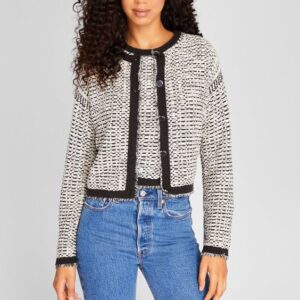
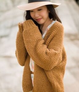
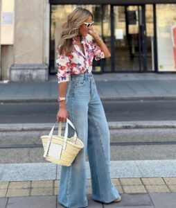
The 3-Color-Rule Cultural Impact
The “rule of three” has a significant cultural impact on the fashion industry, influencing not only design principles but also consumer preferences, marketing strategies, and the overall perception of aesthetics. Here are several ways in which the rule of three manifests its cultural impact:
- Visual Harmony and Balance: The rule of three is deeply ingrained in human perception and psychology. In fashion, it helps designers create visually harmonious and balanced compositions that are pleasing to the eye. Whether it’s selecting color combinations, arranging accessories, or designing patterns, adhering to the rule of three enhances the overall appeal of fashion garments and ensembles.
- Memorability and Recognition: The principle of threes is often used in fashion branding and marketing to create memorable and recognizable imagery. From advertising campaigns to logo design, companies leverage the rule of three to ensure their brand identity resonates with consumers and stands out in a crowded marketplace. For example, many fashion logos incorporate three elements or utilize three distinct colors to enhance memorability.
- Styling and Personal Expression: For stylists and fashion enthusiasts, the rule of three serves as a guiding principle for creating cohesive and impactful looks. Whether it’s layering clothing, accessorizing outfits, or mixing patterns, adhering to the rule of three allows individuals to express their personal style with confidence and flair. By striking the right balance between elements, they can achieve a polished and put-together appearance that reflects their unique taste and personality.
- Cultural Symbolism and Tradition: The rule of three holds cultural significance in various traditions and belief systems around the world. In fashion, it may be interpreted through the lens of cultural symbolism, where certain combinations of colors, patterns, or motifs carry specific meanings or convey cultural heritage. By incorporating elements of the rule of three into their designs, fashion designers can pay homage to cultural traditions and resonate with diverse audiences.
- Fashion Trends and Evolution: Over time, the rule of three has become entrenched in fashion trends and design aesthetics. From the classic trio of primary colors to the timeless elegance of three-piece suits, fashion trends often reflect the enduring appeal of the rule of three. As fashion evolves, designers continue to find innovative ways to reinterpret this principle, adapting it to contemporary tastes and preferences while honoring its cultural legacy.
Overall, the rule of three plays a multifaceted role in the fashion industry, shaping design practices, consumer behavior, and cultural norms. Its enduring presence underscores its timeless relevance and universal appeal, making it a cornerstone of fashion aesthetics and expression.
The 3-Color-Rule In Fashion
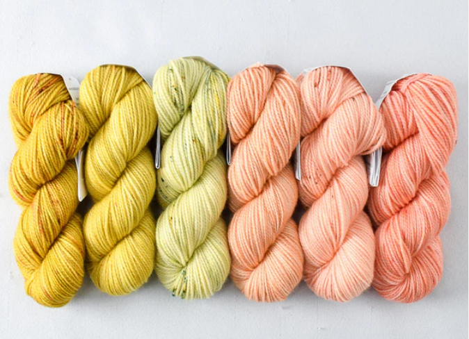
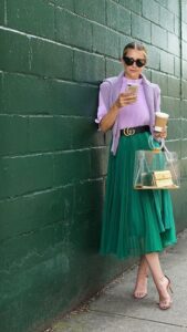
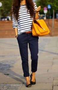
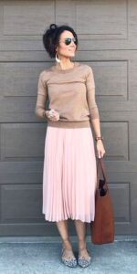
The three-color rule is a helpful guideline in fashion for creating stylish and cohesive outfits.
While it’s not an absolute law (I just do not like to talk about rules when it comes to fashion!), it is true that it offers a framework for achieving balanced and visually appealing looks.
Here’s how it works:
1. Choose a dominant Color: Start by choosing a dominant color for your outfit. This color will be the main focus and should appear in the largest portion of your ensemble.
2. Pick a Secondary Color: Next, select a secondary color that complements the dominant color. This color should appear in smaller amounts and harmonize with the dominant shade. It can be either a lighter or darker hue to the dominant one or a complementary color (I’ll talk about the color wheel and complementary colors later on).
3. Decide an Accent Shade: Finally, add an accent shade. This color provides a pop of interest and can appear in accessories, makeup, or other details. Keep it minimal to maintain balance.
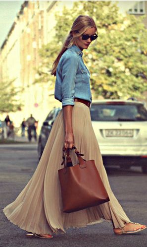
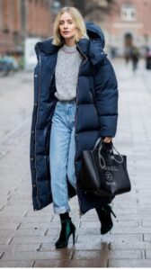
Remember that black and white are technically non-colors, so they can be intermixed without counting as additional colors. You can freely incorporate black and white elements in your outfit, treating them as foundational neutrals.
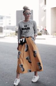
Additionally, prints with more than three colors can serve as the focal point of your ensemble, while the supporting components should stick to three solid colors present in the print.
The Appeal of Three
When it comes to fashion, the “rule of three” is a design principle that suggests that objects or elements arranged in odd numbers are more appealing, memorable, and effective than even-numbered arrangements. This principle is often applied in various aspects of fashion, including outfit styling and accessory pairing.
In fashion, this rule can be applied in several ways:
- When creating an outfit, stylists often recommend incorporating three key pieces or colors to achieve a balanced and visually interesting look.
- When accessorizing, the rule of three can be applied by wearing three complementary accessories, such as a necklace, bracelet, and earrings, to create a cohesive and polished ensemble.
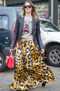
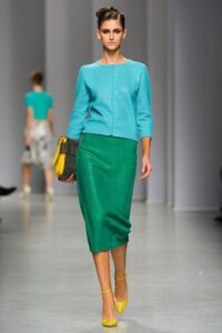
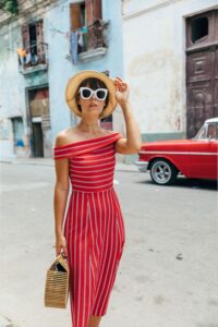
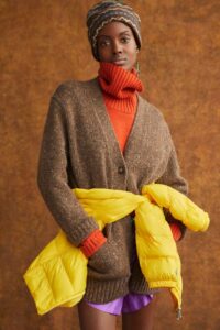
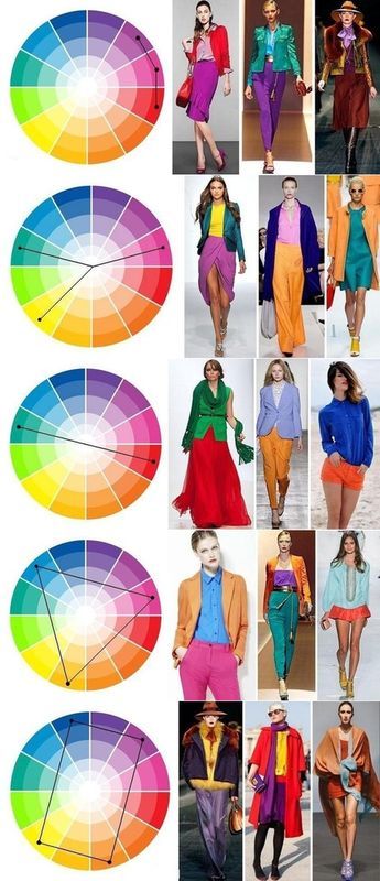
- In pattern mixing, incorporating three different patterns in an outfit can create a harmonious and dynamic visual effect. In fact, if we analyze the last image on the right below, and break down the colour palette, we can see that what looks like a plethora of colors at first sight, gets reduced to just three colors: yellow, red and baby blue, due to the presence of neutrals (black and light grey in this case).
The Three-Color Rule in 6 Steps
1.Simplicity and Cohesion:
The 3-color rule is based on the idea that limiting the number of colors in an outfit helps to create a sense of simplicity and cohesion. By focusing on a small color palette, you can ensure that your outfit looks intentional and well put together.
2. Ease of Coordination:
Using only three colors makes it easier to coordinate different elements of your outfit, such as clothing, accessories, and shoes. You can mix and match pieces more effortlessly without worrying about clashing colors or overwhelming your look.
3. Visual Balance:
Limiting the number of colors in an outfit also helps to create visual balance. By distributing the colors evenly throughout your ensemble, you can achieve a more harmonious and pleasing aesthetic.
4. Versatility:
Following the 3-color rule can make your outfits more versatile, as they are likely to work well in a variety of settings and occasions. You can create different looks by simply changing a few pieces (like bag and footwear) while sticking to the same color palette.
5. Exceptions and Flexibility:
While the 3-color rule is a helpful guideline, it’s not a strict rule that must be followed at all times. Fashion is subjective, and there are no hard and fast rules when it comes to personal style. Feel free to experiment with different color combinations and find what works best for you!
6. Adaptation to Trends:
The 3-color rule can be adapted to current fashion trends and seasonal palettes. You can incorporate trendy colors or seasonal hues into your outfit while still adhering to the overall principle of limiting the number of colors.
Texture & Pattern
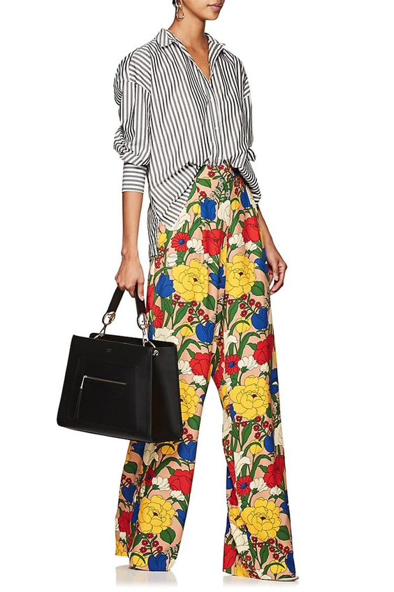
Patterns and textures play a crucial role in the world of fashion and design, adding depth, interest, and personality to outfits.
Here’s a breakdown of their roles:
Patterns
- Visual Interest: Patterns, such as stripes, florals, plaids, or geometric designs, add visual interest to clothing and interiors, making them more dynamic and engaging.
- Expression of Style: Different patterns can convey various styles and moods. For instance, florals often evoke a feminine and romantic vibe, while geometric patterns can exude a modern and bold aesthetic.
- Mixing and Matching: Skillful mixing of patterns can elevate an outfit or space. However, it’s important to balance the scale and intensity of patterns to avoid overwhelming the overall look.
- Versatility: Patterns can be utilized to highlight or divert attention. For example, vertical stripes can create a slimming effect, while a bold print can become a focal point of an ensemble.
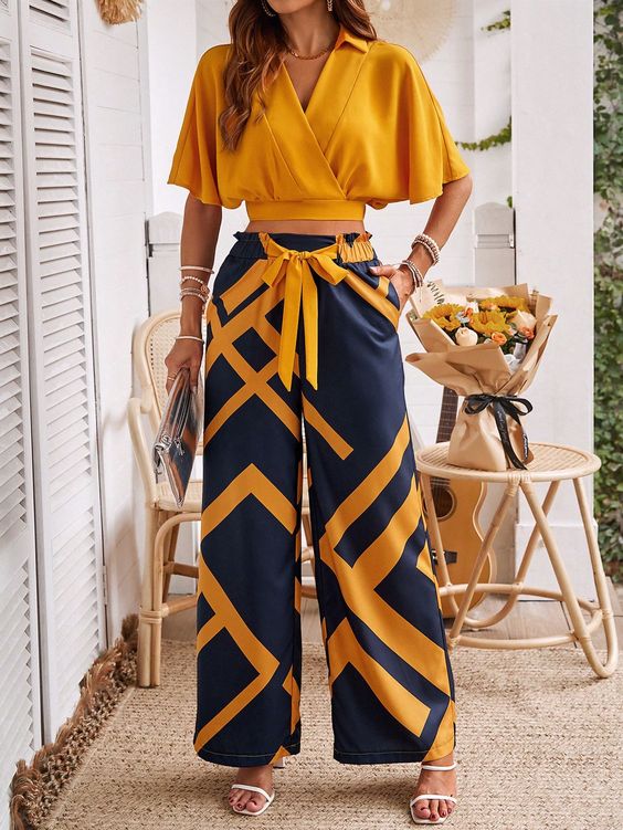
Textures
- Tactile Appeal: Textures, such as lace, velvet, denim, or silk, add a tactile dimension to fashion, creating a richer and more sensory experience.
- Depth and Dimension: Incorporating different textures can add depth and dimension to an outfit, making it visually compelling and inviting.
- Seasonal Adaptability: Textures often evoke a seasonal feel. For instance, lightweight fabrics like linen and cotton are associated with summer, while heavier textures like wool and cashmere are suited for colder months.
- Contrast and Balance: Mixing textures can create contrast and balance within an outfit, contributing to a harmonious and well-rounded aesthetic.
In essence, patterns and textures are powerful tools that allow you to express your creativity and personality. When used thoughtfully, they can transform an ordinary ensemble into a captivating and visually appealing work of art.
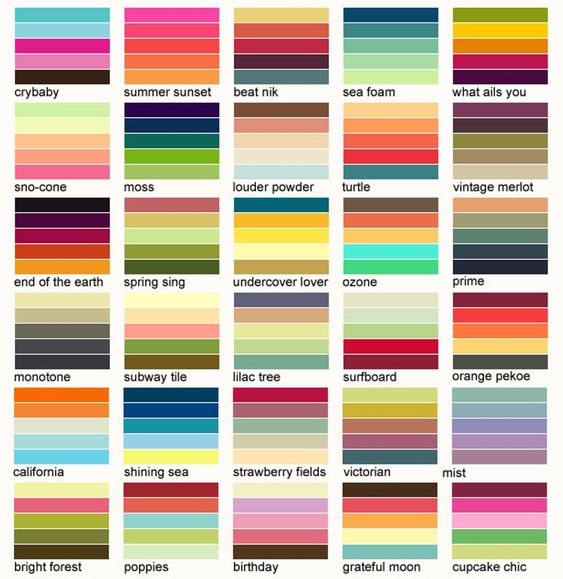
Knowing what colors work best together
Following are two great color schemes I saved on my Pinterest board “Color Palette” that I find very useful, especially if you are new to playing with color families. I think they are very well done and they give you a wide range of possibilities to experiment with hues: great for a first approach to mixing and matching!
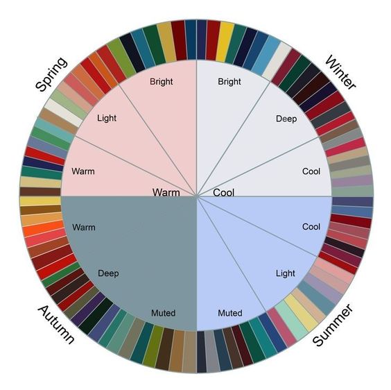
Choosing a season-appropriate color palette
Season-appropriate color combinations in fashion are a way of incorporating colors that are commonly associated with specific seasons to create stylish and harmonious outfits. These color combinations are influenced by the changing seasons and the associated color palettes typically seen during those times of the year.
Here are some examples of season-appropriate color combinations:
Spring:
- Pastel hues such as soft pinks, light blues, and pale yellows are commonly associated with spring.
- Pairing pastel colors with crisp whites or light neutrals can evoke a fresh and airy springtime look.
- Incorporating floral prints and soft greens can further enhance a spring-inspired color palette.
Summer:
- Bright and vibrant colors like turquoise, coral, and sunny yellow are popular choices for summer.
- Combining bold hues with tropical-inspired prints or nautical stripes can create a summery and energetic aesthetic.
- Neutrals such as sand, ivory, and khaki can complement summer colors and create a balanced look.
Fall:
- Warm and earthy tones such as rust, olive green, and mustard yellow are often associated with the fall season.
- Deep jewel tones like burgundy, emerald, and sapphire can add richness to fall color palettes.
- Pairing these colors with classic autumn neutrals such as taupe, camel, and chocolate brown can create a cozy and sophisticated feel.
Winter:
- Cool tones like icy blue, silver, and deep plum are commonly used in winter color schemes.
- Rich and luxurious hues such as deep red, forest green, and royal blue can evoke a sense of winter elegance.
- Mixing in metallic accents such as gold or silver can add a festive touch to winter outfits.
By incorporating season-appropriate color combinations into your wardrobe, you can create cohesive and visually appealing looks that reflect the spirit of each season.
The importance of complementary colors
First of all, let’s clarify the meaning of complementary color:
Complementary colors are pairs of colors that, when combined, cancel each other out. This means that they produce a grey-scale color, such as white or black.
When placed next to each other, they create the strongest contrast and reinforce each other, making each color appear more vibrant. The pairs of complementary colors are:
- Red and green
- Blue and orange
- Yellow and purple
These combinations are commonly used in art, design, and color theory to create dynamic and visually appealing compositions.
Color Contrasts in Fashion
There are several types of color contrasts commonly used in fashion. The following examples illustrate how color contrasts, whether through color combinations, texture contrasts, or pattern mixing, can be effectively utilized in fashion to create visually appealing and stylish ensembles:
Complementary Contrasts
- A classic example of a complementary contrast in fashion is an outfit that pairs a deep blue top with vibrant orange accessories or bottoms. The contrast between the two colors creates a visually striking and bold look.
Analogous Contrasts
- An outfit featuring a blend of red, orange, and yellow hues exemplifies an analogous contrast. This combination creates a harmonious and sophisticated look, especially when the colors are layered or incorporated into different pieces within the outfit.
Triadic Contrasts
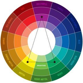
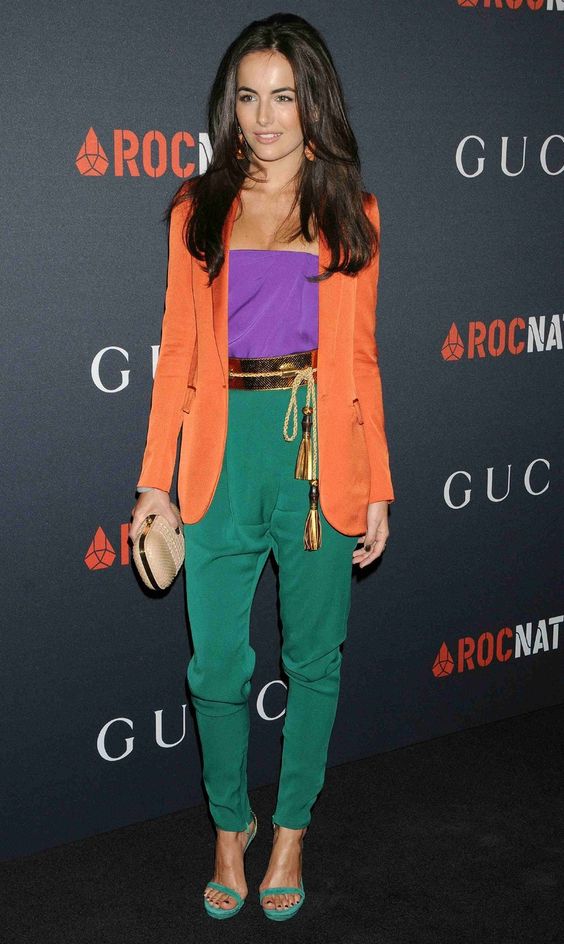
- A fashion ensemble that incorporates three equally spaced colors on the color wheel, such as a combination of green, purple, and orange, can create a vibrant and balanced look. This type of contrast adds visual interest and dynamism to the outfit.
Monochromatic Contrasts
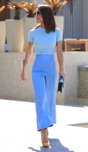
- A monochromatic contrast can be achieved through the use of different shades of a single color. For instance, an outfit that combines varying shades of blue, from navy to sky blue, creates a sleek and sophisticated monochromatic look.
Texture and Pattern Contrasts
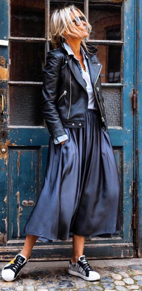
- Pairing a textured piece, such as a chunky knit sweater, with a smooth and sleek bottom, like leather pants, showcases a contrast in texture, adding depth and visual interest to the outfit.
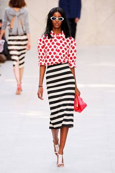
- Mixing patterns with contrasting elements, such as pairing a striped shirt with a floral skirt, demonstrates an effective use of pattern contrast, resulting in a visually dynamic and unique outfit.
Here are some examples:
In conclusion, girls, color contrasts play a pivotal role in fashion, offering designers and stylists a powerful tool for creating visually captivating and harmonious ensembles. And sticking to the 3-color rule makes it work amazingly!
Whether through the bold impact of complementary contrasts, the sophisticated harmony of analogous combinations, the vibrancy of triadic contrasts, or the sleek elegance of monochromatic palettes, strategic use of color can elevate the impact of fashion ensembles.
Furthermore, the incorporation of texture and pattern contrasts adds depth and individuality to outfits, allowing for the expression of creativity and style. Ultimately, understanding and effectively utilizing the 3-color rule in fashion empowers you to craft outfits that not only visually stand out but also evoke specific emotions and moods, contributing to the artistry and allure of the fashion world.
So, girls, that’s all from me this week! I hope you liked the topic (if so, please let me know!), and looking forward to catching you in seven days.
Thank you for reading, and, until we meet again, don’t forget to stay stylish!
Love you all,
Agnese K

